What if you could borrow money to buy more stocks and multiply your gains? Or imagine selling shares you don’t even own, betting their price will fall so you can buy them back cheaper later. Yes, the Indian financial markets offer you these opportunities and these intriguing strategies are known as margin trading and short selling. While both offer unique opportunities to potentially boost your returns (or losses), they operate in fundamentally different ways.
Today, we are going to explore the difference between margin trading and short selling. We will look at what it means to be buying on margin vs short selling, and understand the unique ways these powerful tools work.
What is Margin Trading?
Margin trading is the practice of buying securities with borrowed funds from a broker, allowing investors to trade larger positions than their own capital permits. Let’s say you are looking at shares of a company named ABC and you strongly believe their price will go up. You have some money, let’s say Rs.25,000, but you wish you could buy more shares to get a bigger profit. This is where margin trading steps in, it is like taking a small loan from your stockbroker to buy more shares than your own cash would allow. You put in a part of the money, and your broker lends you the rest. This way, you get to control a larger number of shares, effectively increasing your purchasing power.
Let’s look at a simple example to see how your gains (or losses) can grow. Suppose you have Rs.25,000 and borrow Rs.75,000 to buy shares worth Rs.1,00,000. If the shares go up by 10% (from Rs.1,00,000 to Rs.1,10,000), your profit is Rs.10,000. On your initial Rs.25,000, this is a 40% return.
However, if the value of your shares fall by 10% (from Rs.1,00,000 to Rs.90,000), your loss is Rs.10,000. This means you lost 40% of your initial Rs.25,000. This illustrates how margin trading can amplify both profits and losses. When an investor borrows money to increase their buying power, any percentage change in the stock price applies to the total value of the position, not just the investor’s initial capital.
Read Also: Difference between Margin Trading and Leverage Trading
What is Short Selling?
Short selling is the practice of selling borrowed securities in anticipation of a price decline, with the aim of buying them back later at a lower price to return to the lender and profit from the difference. Imagine you are watching a company named XYZ and you have a strong feeling that its share price is going to drop because of some reports and news. Most people buy shares hoping they will go up. But what if you could make money when prices go down. This is exactly what short selling allows you to do.
Let’s look at a simple example, suppose you think the shares of XYZ, currently trading at Rs.150 will fall. You borrow 100 shares and sell them for Rs.15,000. Later, the price drops to Rs.120. You buy 100 shares for Rs.12,000. You return the shares and your profit is Rs.15,000 – Rs.12,000 = Rs.3,000 (minus broker fees).
But if the price goes up to Rs.180, you still have to buy them back at Rs.180 to return them. Your loss would be Rs.15,000 – Rs.18,000 = – Rs.3,000. This illustrates a critical aspect of short selling, the possibility for losses can be unlimited. Unlike buying a stock where losses are capped at the initial investment, there is theoretically no upper limit to how high a stock price can rise.
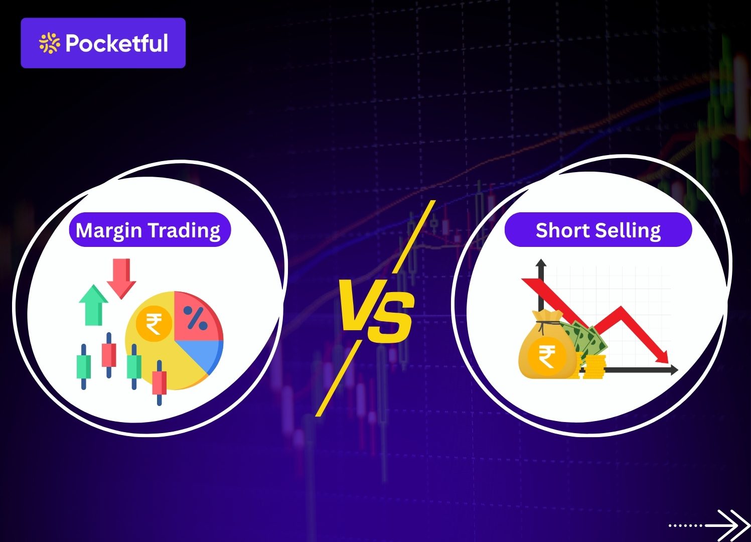
Margin Trading vs. Short Selling
Now that we understand what margin trading and short selling are individually, let’s look at how they are different. Even though both involve using borrowed funds or shares, their goals and how they work are quite opposite. This will help you clearly see the distinction between buying on margin vs short selling.
Market Outlook
- Margin Trading : You use this strategy when you are hopeful (optimistic) about a stock. You believe its price will go up.
- Short Selling : You use this when you are cautious or pessimistic about a stock. You believe its price will go down.
How You Make Money
- Margin Trading : You make money when the price of the shares you bought goes up.
- Short Selling : You make money when the price of the shares you sold (which you borrowed) goes down, allowing you to buy them back cheaper.
Using Borrowed Funds
- Margin Trading : You borrow money from your broker to buy more shares.
- Short Selling : You borrow shares from your broker to sell them, even though you do not own them.
This table will help you quickly understand the main differences between these two strategies.
| Feature | Margin Trading | Short Selling |
|---|---|---|
| Market Outlook | Expecting price to increase | Expecting prices to fall |
| Mechanism | Money is borrowed to increase purchasing power | Securities are borrowed and sold |
| Profit Conditions | Profit from rising stock price | Profits are earned with declining stock price |
| Risk | Losses can exceed initial investment, but are limited | Unlimited loss potential |
| Market Conditions | Works well in bullish market | Great during bearish market |
Read Also: Differences Between MTF and Loan Against Shares
Advantages and Disadvantages
Every trading strategy in the market comes with its own set of benefits and risks. Both margin trading and short selling are no different. Understanding their upsides and downsides is crucial before you use them.
Advantages of Margin Trading
- Increased Buying Power : The biggest advantage is that you can buy more shares than your own money would allow. This means you can participate in larger trades, potentially leading to higher returns.
- Potential Profits : If the stock price moves in your favor, your profits can be much higher than if you had only used your own money. The leverage amplifies your gains.
- More Flexibility : It gives you quick access to funds. You can take advantage of short-term market opportunities without having to sell your existing investments.
Disadvantages of Margin Trading
- Magnified Losses : Just as profits are amplified, so are losses. If the stock price falls, you can lose much more than your initial investment.
- Interest Payments : The money you borrow from your broker comes with interest charges. These costs can eat into your profits, especially if your gains are small or if you hold the position for a long time.
- Risk of Margin Calls & Liquidation : If your investment drops significantly, you might get a ‘margin call’ asking for more money. If you cannot pay, your broker can sell your shares, leading to forced losses.
Short Selling Advantages
- Profits : This is unique as short selling allows you to make money even when the overall market or a specific stock is going down. This is very useful in a ‘bearish’ market.
- Hedging : You can use short selling as a protective shield for your existing investments. If you own many shares, short selling a few related ones can help reduce your overall risk if the market drops.
- Fair Prices : Short sellers often bet against companies they believe are overvalued. This activity helps bring down inflated stock prices, making the market more fair and efficient.
Short Selling Disadvantages
- Unlimited Losses : This is the biggest and most serious risk. Unlike buying a stock where you can only lose what you invested, a stock’s price can theoretically rise endlessly. This means your losses from short selling could be much, much larger than you expect.
- Margin Calls : If the price of the stock you shorted starts to rise sharply, your broker will likely issue a margin call, asking for more funds.
- Knowledge & Timing : Short selling is complex, it requires deep research, accurate predictions, and excellent timing. It is generally not for beginners.
Read Also: Difference Between Intraday Trading and Delivery Trading
Conclusion
You now understand the core difference between margin trading and short selling, and what it means when people talk about buying on margin vs short selling. Both strategies offer unique ways to potentially make money in the stock market, whether you are hopeful about rising prices or cautious about falling ones.
However, it is very important to remember that both these strategies involve using borrowed money or shares. This means they can amplify your profits, but they can also dramatically increase your losses. They are not for everyone, especially not for those new to the market. Always approach them with a clear mind, thorough research, and a strong understanding of the risks involved. Your financial journey is unique, and what works for one person might not work for another.
Frequently Asked Questions (FAQs)
Do every stock broker provide margin trading and short selling facility?
No, not all stock brokers offer these facilities. To engage in margin trading, you need a broker that provides a ‘Margin Trading Facility’ (MTF). For both margin trading and short selling, you will need to open a special ‘margin account’ with your broker.
How much shall I invest to start margin trading?
There is not one fixed amount, as it depends on your broker’s rules and the price of the shares you want to buy. Brokers usually ask for an ‘initial margin’, which is a percentage of the total value of the shares (often around 20% to 25% for stocks).
In India, is short selling limited to intraday trades?
For regular stock trading (cash segment) by retail investors in India, short selling is generally restricted to ‘intraday’ trading. This means you must close your position (buy back the shares) by the end of the same trading day.
How can I mitigate risks?
These strategies carry high risks, so protecting your money is very important. Start small, use stop loss orders, avoid over leveraging, research thoroughly, monitor regularly, maintain sufficient funds.
Are profits from margin trading and short selling taxable?
Yes, both are taxable. Profits or losses are treated as business income or capital gains depending on how frequently you trade, and you are required to report them while filing taxes.