Books have always been a timeless source of knowledge, offering guidance and insights across every field of life. The world of trading is no different, with countless books written on strategies and market behavior to help readers sharpen their skills and make better decisions.
What many traders often overlook is that there are excellent books dedicated specifically to commodity trading. These resources explain how commodity markets work and provide strategies, risk management techniques, and analytical approaches that can be applied in real-world trading.
In this guide, we will explore the 10 best books on commodity trading that every aspiring or seasoned trader should read to strengthen their understanding and approach.
10 Best Commodity Trading Books in 2026
Commodity trading books are guides that help readers understand how to buy and sell physical goods like oil, metals, agricultural produce, and more through exchanges. These books cover topics such as:
- How commodity markets work
- Futures and options trading
- Risk management in commodities
- Technical and fundamental analysis
- Real-life trading examples and strategies
These books are perfect for both beginners and seasoned traders who are looking to earn from the market. So, here are the best commodity trading books that you must consider.
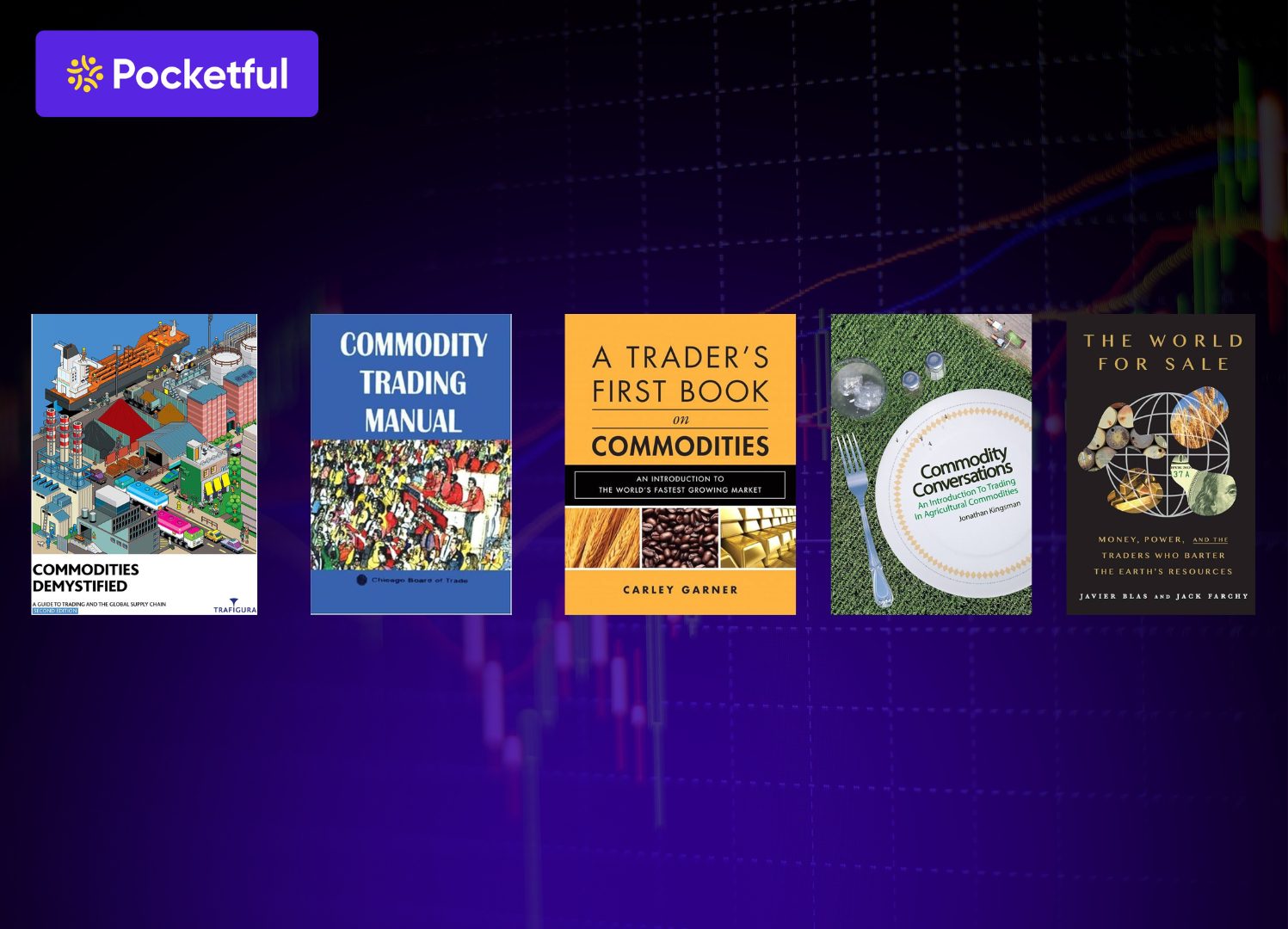
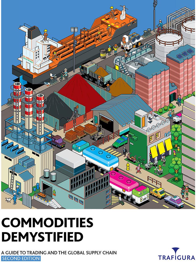
1. Commodities Demystified: A Guide to Trading and The Global Supply Chain – Trafigura
This book simplifies how global commodity trading really works. It is based on Trafigura’s experience in energy, metals, and minerals. It explains how goods are sourced, stored, blended, and delivered.
This book mainly focuses on logistics, risk management, and how traders add value across supply chains. This book helps connect the dots between trading desks and real-world supply networks.
What the book covers:
- How commodity trading firms operate
- Sourcing, storage, and delivery of physical commodities
- Risk management and arbitrage opportunities in commodity trading
- Logistics and the global supply chain for commodities
This book shows how critical commodity traders are to the global economy. It is ideal for beginners and professionals who want to understand trade and global markets.
2. Commodity Trading Manual – Board of Trade Chicago
This manual is a go-to guide for anyone looking to understand how commodity and futures trading really works. It is published by the Chicago Board of Trade. It offers a detailed look at how futures markets are structured and how traders manage risk through hedging and speculation.
It covers everything from agricultural and energy markets to metals and financial futures. With insights on spreading strategies, options on futures, and electronic trading, the book is packed with practical knowledge.
What the book covers:
- Futures market structure and clearing
- Hedging and speculation techniques
- Major commodity market segments
- Options and spread strategies
- Evolution of trading systems
This is a practical book that shares not only technical details but also strategies that are key to making the right trading decisions.
3. A Trader’s First Book on Commodities: An Introduction to the World’s Fastest Growing Market – Carley Garner
This book is beginner-friendly and one of the best books on commodity trading. It makes the world of commodity trading easy to understand. Carley Garner walks readers through the basics here. Right from choosing the right broker to managing margin calls and placing smart trades, everything is shared here.
The author explains key concepts like order types, profit and loss calculations, and trading plans in a simple, practical way. The book also highlights the emotional side of trading. Also, it guides on how to stay disciplined.
What the book covers:
- Market basics and order types
- Choosing brokers and platforms
- Risk and margin management
- Trading plans and discipline
With real industry insights, it helps new and intermediate traders build a strong foundation. This is one of the reasons why it is called the first book on commodities.
4. Commodity Conversations: An Introduction to Trading in Agricultural Commodities – Jonathan Kingsman
This book is a practical and engaging guide for anyone exploring agricultural markets. Jonathan Kingsman, with nearly 40 years of industry experience, explains how supply and demand, seasonal patterns, and global events shape commodity prices.
Author also covers risk management techniques like hedging and analysis tools to support smart trading decisions.
What the book covers:
- Market drivers and price trends analysis
- Risk management and hedging strategies to try
- Trading strategies and analysis
- Real-world insights from the field
With real-life examples and a beginner-friendly style, it stands out as one of the best commodity trading books for understanding agri-commodities.
5. The Professional Commodity Trader – Stanley Kroll
This is a classic book that gives a firsthand look into the world of commodity trading. This book was written by Stanley Kroll who was a respected broker and trader. He shared real trade examples, strategies, and personal lessons learned over decades in the market.
Using his knowledge and experience, he shared topics like charting, timing, risk management, and others. He shared the trader psychology with honesty and clarity. Though the book was written quite early, it still shares the insights that will help you greatly.
What the book covers:
- Trade timing and charting methods
- Market psychology and discipline
- Practical risk management
- Real-world trading experiences
This is a true classic among the best commodity trading books. It is a timeless read for anyone serious about trading.
6. The World for Sale: Money, Power and the Traders Who Barter the Earth’s Resources – Javier Blas and Jack Farchy
This is one of the best commodity trading books in recent years. This book is quite engaging and shares the hidden details of the global market. It shares the factors that influence and operate the markets. This includes the bold and often controversial deals made by firms like Glencore and Trafigura.
These are the trades that shaped geopolitics and built empires trading oil, metals, and minerals. The book dives into real events across war zones, collapsing economies, and emerging markets. This shows how traders operate behind the scenes.
What the book covers:
- Rise of trading giants like Glencore
- Global impact of commodity deals
- Trading in unstable regions
- Real-world stories of power and profit
It is a must-read as this book will help you understand how the global commodity market works.
7. Hot Commodities: How Anyone Can Invest Profitably in the World’s Best Market – Jim Rogers
This book is a practical and insightful guide to investing directly in commodities. Jim Rogers explains why resources like sugar, corn, oil, and cotton are long-term wealth creators. This guide also highlights why commodities are key investment options, especially during inflationary periods.
He explores how supply and demand drive prices and why commodities move differently from stocks, offering real diversification. This is backed by historical trends and clear logic. Rogers makes the case for investing in raw materials over commodity-linked companies.
What the book covers:
- Commodity market cycles and trends
- Supply and demand fundamentals
- Direct and indirect investing
- Strategies for long-term investors
A solid read for anyone looking to understand real assets and commodities, this book is packed with insights that can help investors greatly.
8. Diary of a Professional Commodity Trader: Lessons from 21 Weeks of Real Trading – Peter L. Brandt
This book offers a rare and unfiltered look into the day-to-day life of a professional trader. Peter Brandt documents 21 weeks of real trades. It includes the complete details with charts, analysis, wins, and losses.
He shares his approach to trade selection, risk management, and emotional discipline. He also shows the realities of trading beyond the textbook theory. With over 40 years of experience, Brandt gives readers both practical lessons and a glimpse into the mindset of a seasoned trader.
What the book covers:
- Real-time trade journaling
- Technical analysis and setups
- Risk and money management
- Trader psychology and discipline
A grounded and honest guide for serious traders, this is a goldmine. The insights shared here and the detailed highlights can help you trade seamlessly.
9. The Great Gold, Silver & Crypto Rush of the 21st Century – Michael Maloney
In this insightful book, Michael Maloney explores how gold, silver, and cryptocurrencies are shaping financial markets. He shares how these assets are shaping the next big shift in global wealth. He shares his deep knowledge of monetary history and financial cycles.
In the book, he explains why these assets may outperform in the coming decade. The book blends education with strategy. This helps readers understand where opportunities lie in this new economic era.
What the book covers:
- Economic cycles and wealth transfer
- Reasons why gold and silver are safe haven
- Cryptocurrencies and their role in markets
- Understanding and developing long-term strategies
This book is an essential read for those who want to invest in precious metals and digital assets. This helps you trade with clarity.
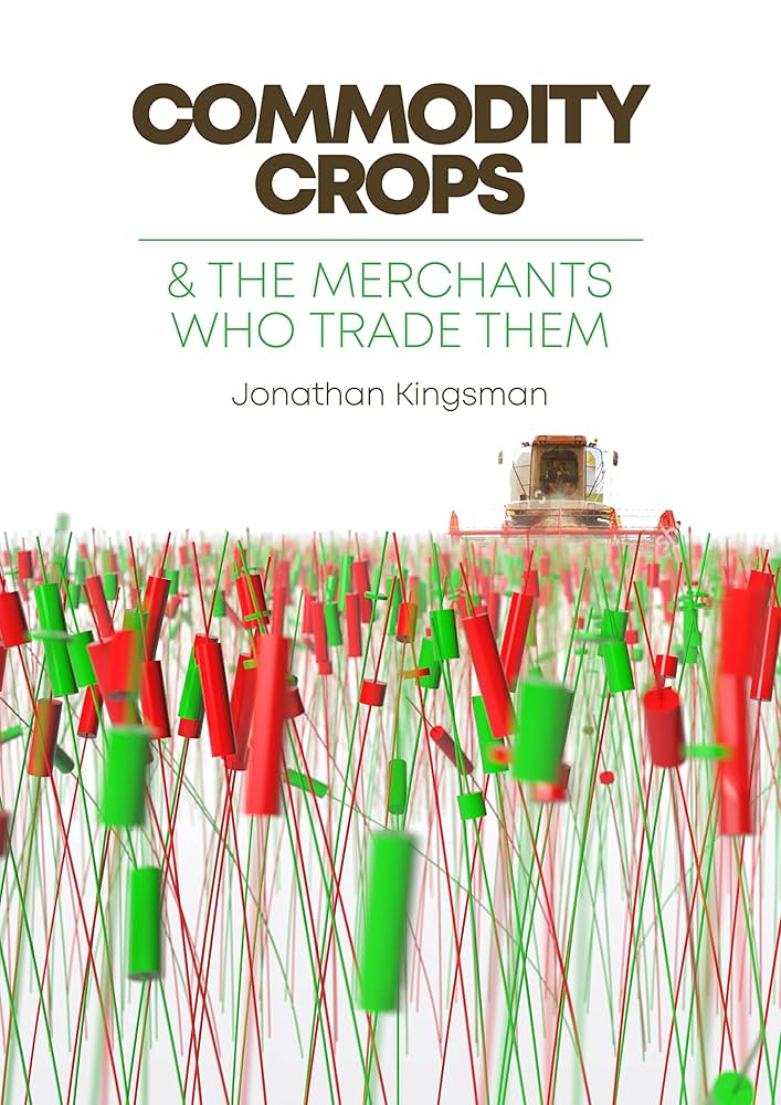
10. Commodity Crops: And The Merchants Who Trade Them – Jonathan Kingsman and Wouter Jacobs
This is a detailed book that provides comprehensive insights into agricultural commodity trading. You can find all the information on agricultural commodity trading here. The author shares the trading history and market dynamics of nine essential crops in this book. This combines deep industry knowledge with interviews from top global traders.
He also addresses modern issues in this book. Some of these include decarbonising food supply chains and navigating global trade challenges. The book sheds light on pricing, logistics, and market forces.
What the book covers:
- History and trading of key crops
- Interviews with global commodity traders
- Market drivers and pricing factors
- Sustainability in agri-trading
This is a valuable read for traders, investors, and agri-professionals who are looking for long-term results.
Conclusion
When it comes to trading, the commodity market is a bit complex. You need to understand various aspects to ensure that you are taking the right call. Lack of knowledge and insights can make it hard for you to trade. This is where you can seek help from the books shared here. These books help you understand markets, strategies, and risks.
The titles shared above are among the best commodity trading books. These are the perfect choices for all traders. Written by experienced professionals, they provide practical insights into markets, trading strategies, and trader psychology.
Ready to start trading smarter?
Start your trading journey with Pocketful and get the tools and support you need to trade smarter.
Frequently Asked Questions (FAQs)
Are commodity trading books suitable for beginners?
Yes, many of these books are beginner-friendly. They explain key concepts like market structure, trading strategies, and risk management. These books share the hard terms in a simple and practical way. Titles like A Trader’s First Book on Commodities are perfect for starting out.
What types of commodities do these books cover?
Most books cover a wide range including agricultural products, energy resources like oil and gas, precious metals, and sometimes even cryptocurrency. Some focus on specific areas such as grains, gold, or crude oil.
Do I need trading experience to understand these books?
No prior experience is required for many of them. Several books are written for readers with zero background and use real-life examples to explain how commodity markets work.
Can reading these books improve my trading decisions?
Yes, these books provide valuable insights that can help you. These can guide you on how to analyze markets, manage risks, and develop strategies. These also guide you on how to control emotions. This knowledge can lead to more informed and confident trading.
How can I start trading commodities after learning from these books?
You can open a free account on Pocketful, where you’ll find easy access to commodity markets along with the tools and support to help you apply what you’ve learned.