Do you want to know how traders accurately predict an upcoming bullish trend? Knowledge about bullish continuation patterns is essential to capture these movements. The Upside Tasuki Gap pattern is one such pattern.
The Upside Tasuki Gap is a bullish continuation candlestick pattern that signals the strength of an upward trend, and the gap denotes the price gap between two bullish candles. In this blog, we will discuss the Upside Tasuki Gap pattern, its interpretation, advantages, and limitations. We will understand the trading setup with the help of an example.
What is the Upside Tasuki Gap pattern?
The Tasuki Gap pattern is a candlestick pattern commonly used in technical analysis to identify the continuation of a price trend. It has two variations named Upside Tasuki Gap and Downside Tasuki Gap. The Upside Tasuki Gap is a candlestick pattern commonly used in technical analysis to identify the continuation of a bullish trend. Traders use this pattern to confirm the strength of a prevailing bullish trend and anticipate further upward momentum in the market.
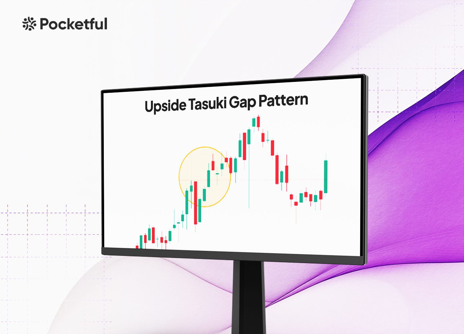
The Upside Tasuki gap candlestick pattern consists of three key candles.
- The first candle is a bullish (green) candle that signifies the prevailing bullish trend.
- The second candle opens higher than the close of the first candle and creates a gap. The stock price continues to move upward and helps in reinforcing the bullish momentum.
- The third candle is bearish (red), but it does not completely close the gap created between the first two bullish candles.
The Upside Tasuki Gap candlestick pattern means that the market sentiment is bullish, and the asset price will continue to increase. When a Upside Tasuki Gap candlestick pattern forms, it shows that the buyers are in control, even though the brief bearish move suggests a minor pullback. The pattern signals that the upward trend is likely to continue, providing the traders with a potential buying opportunity.
Interpretation of Upside Tasuki Gap pattern
The Upside Tasuki Gap is a bullish continuation pattern that traders use to confirm the strength of an ongoing uptrend. The Upside Tasuki gap candlestick pattern helps traders make informed decisions when identifying the potential entry points for long positions.
The gap between the first two candles shows a sudden increase in buying interest, while the failure of the third candle to fill that gap indicates a brief pause or pullback rather than a reversal.
In practice, traders use the Upside Tasuki Gap candlestick pattern as confirmation to either hold their long positions or enter new trades in anticipation of further upward movement. It is especially useful in trend markets where continuation patterns lіke the Tasuki Gap are most effective. Overall, the Upside Tasuki Gap candlestick pattern signals an opportunity for traders to capitalize on bullish market conditions, reinforcing their belief in the ongoing trend.
How to Determine entry, Target and Stop-loss?
When trading using the Upside Tasuki Gap candlestick pattern, it is essential to determine precise entry, target, and stop-loss (SL) levels to minimize risk and to maximize the potential profits. Understanding the below-mentioned trading setup can help traders strategically manage their positions.
- entry Point: The Upside Tasuki Gap candlestick pattern provides a clear signal for traders to enter the market after confirming the bullish momentum. Typically, the ideal entry point is after the third candle (the bearish candle), i.e., when it fails to close the gap created between the first two bullish candles. This failure signals that the sellers are weak, and an uptrend is likely to continue.
- Stop-Loss (SL): A commonly used approach is setting the stop-loss slightly below the low of the third (bearish) candle or below the gap created between the first and second bullish candles. This ensures that if the price gives a breakdown and closes the gap, the trade is closed before further losses.
- Target: The target for the Upside Tasuki Gap candlestick pattern can be determined by using the technical indicators like Fibonacci extensions or by measuring the size of the gap between the first two bullish candles and projecting that upward. Traders can also aim for previous resistance levels or psychological price points (round numbers), which are often used as profit taking areas in uptrends.
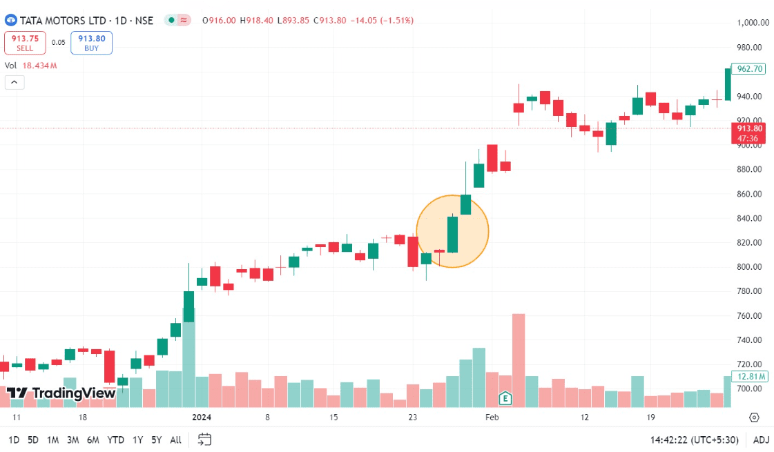
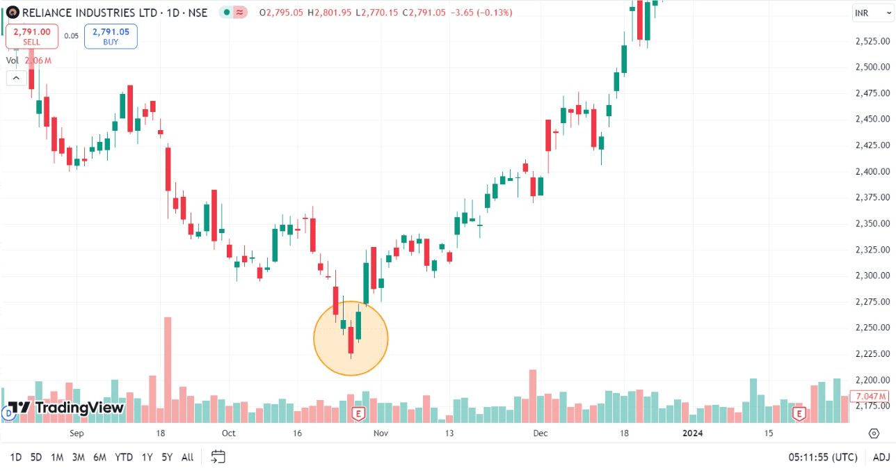
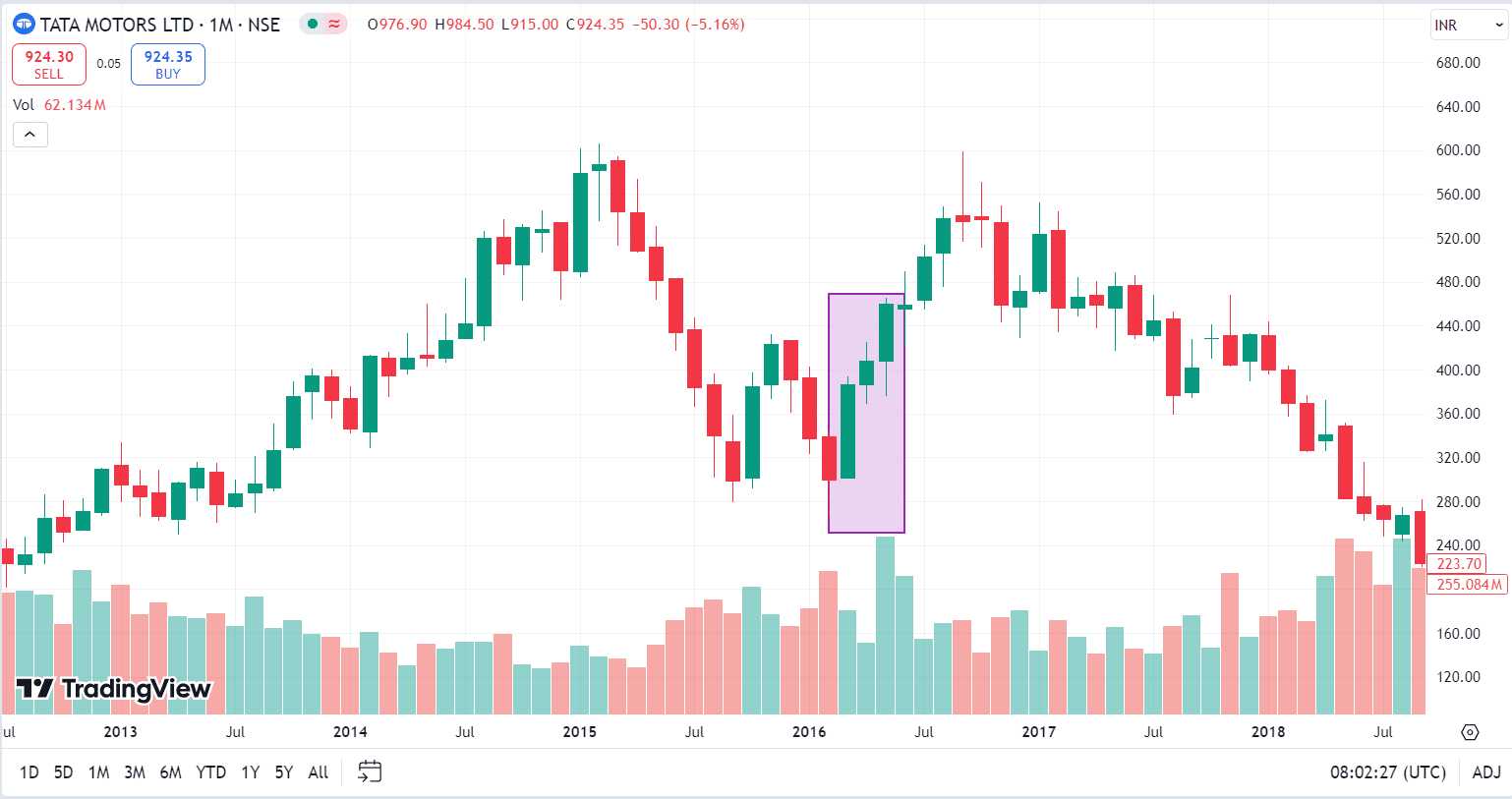
Example of Tasuki Gap candlestick pattern of Tata steel ltd.
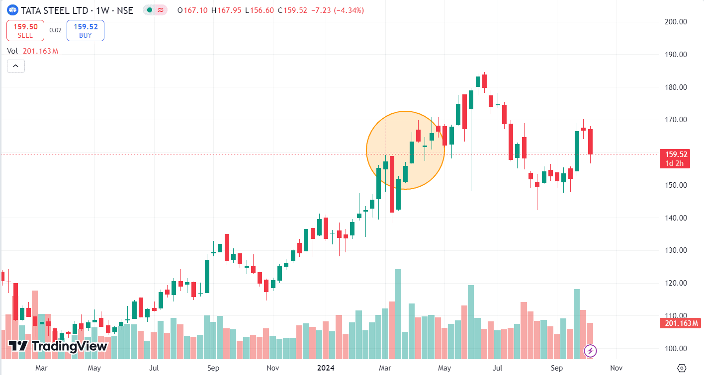
The above image shows the weekly price chart of Tata Steel Ltd., which is listed on the National Stock exchange (NSe) of India. Key observations are:
- Uptrend: The stock increased from INR 102 on 20 March 2023 to INR 151.8 on 18 March 2024, suggesting a bullish sentiment among investors.
- Upside Tasuki Gap: A significant gap appears on the chart between the two bullish candles, as shown in the highlighted circle. The first candle closes at INR 155.85, and the second candle opens at INR 156.80, indicating a gap of INR 0.95 between them. A bearish candle appears after the bullish candles and doesn’t close the gap between them, thereby completing the pattern. After the formation of the pattern, the price increased and reached a high of INR 183.15 on 10 June 2024.
- Volume: The volume bars below the price chart show fluctuations in trading activity. Higher volume generally indicates increased interest and a high probability of price movement.
Read Also: Downside Tasuki Gap Candlestick Pattern
Advantages of Upside Tasuki Gap pattern
The advantages of the Upside Tasuki Gap pattern are:
1. Clear Continuation Signal: One of the main advantages of the Upside Tasuki Gap candlestick pattern is its ability to provide a clear continuation signal. It indicates that after a period of strong upward movement, the bulls remain in control of the mаrket and the trend is likely to continue. This allows traders to create long positions with confidence, knowing that the pattern supports the continuation of the upward momentum.
2. easy Identification: The Upside Tasuki gap candlestick pattern is relatively easy to spot on a chart even for the novice traders. It consists of just three candles with the first two being bullish, separated by a gap, and the third being a small bearish candle that fails to close the gap. This simplicity makes it useful for new traders and enables quick decision-making without the need for complex analysis.
Limitations of Upside Tasuki Gap pattern
The limitations of the Upside Tasuki Gap pattern are:
1. Works Best in Trending Markets: One of the major limitations of the Upside Tasuki Gap is that it is most effective in well-established uptrends. In sideways or choppy markets, this pattern may not provide reliable signals. In such market conditions, the pattern signal can generate false signals that can lead to losses. Traders must confirm the presence of a strong trend before relying on the pattern for decision-making.
2. Limited Use in Predicting Reversals: The Upside Tasuki gap candlestick pattern is primarily a continuation pattern and does not signal trend reversals. Traders looking for signs of a market turning point may not benefit from this pattern as it only provides insight into the continuation of an existing bullish trend. This limits its utility for traders who focus on identifying the reversals or shifts in market direction.
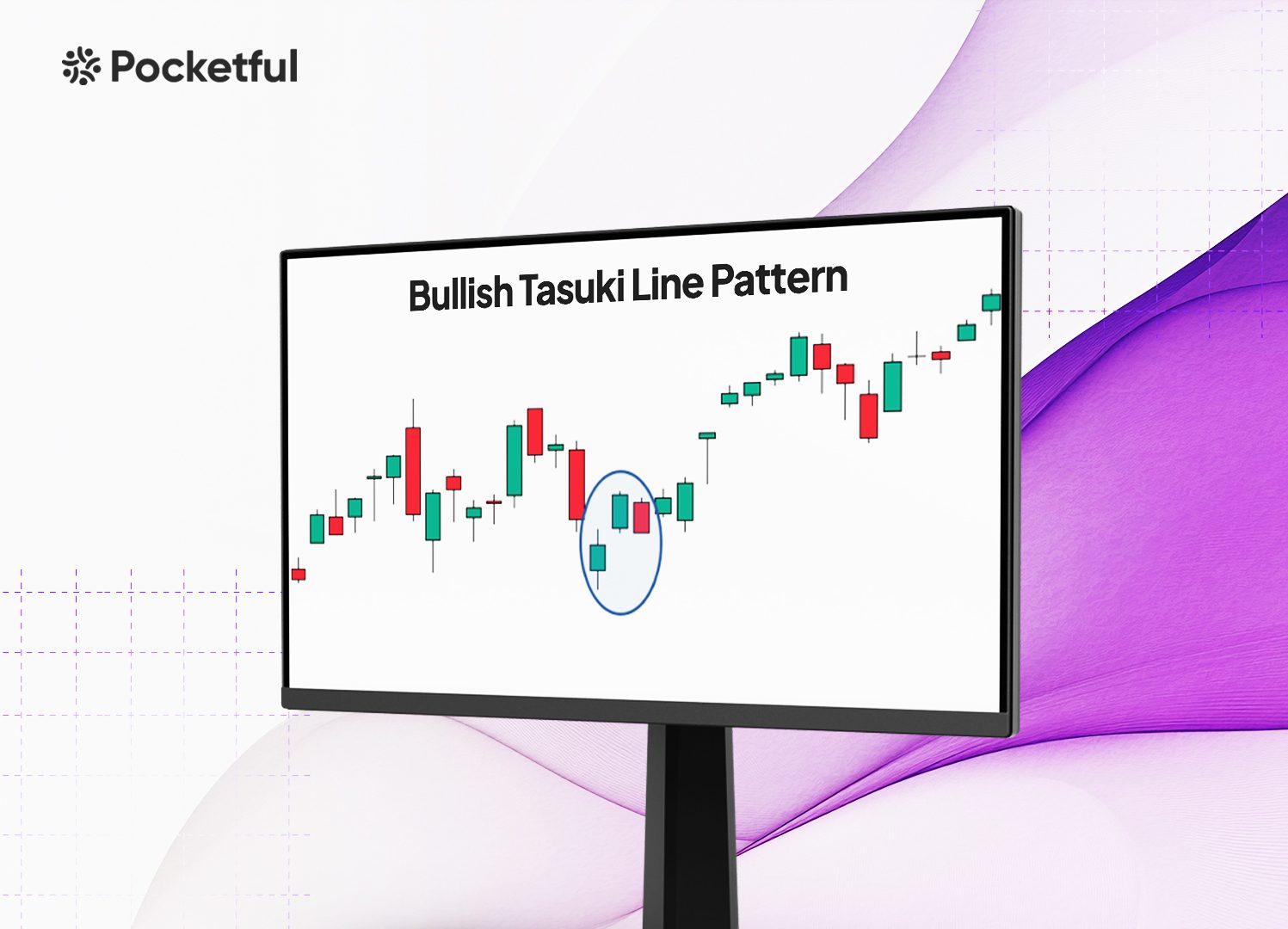
Read Also: Bullish Tasuki Line Pattern
Conclusion
The Upside Tasuki Gap is a bullish continuation candlestick pattern that helps the traders to confirm the strength of an ongoing uptrend. Its formation consists of two bullish candles followed by a small bearish one that fails to close the gap and signals that the market is likely to continue its upward momentum. While effective in trending markets, this pattern has limitations, including the risk of false signals in sideways markets and its dependence on other technical indicators for confirmation. Traders can use the Upside Tasuki Gap candlestick pattern to identify potential buying opportunities.
Frequently Asked Questions (FAQs)
How is the Upside Tasuki Gap pattern used in trading?
Traders use the Upside Tasuki Gap pattern to confirm the strength of an ongoing uptrend and create or hold long positions.
How reliable is the Upside Tasuki Gap pattern?
The Upside Tasuki Gap candlestick pattern is most reliable in strong and established uptrends. However, it can produce false signals in weaker or sideways markets.
What are the limitations of the Upside Tasuki Gap pattern?
The pattern’s limitations include its false signals in sideways markets and the need for confirmation from other indicators. It also doesn’t signal reversals, which limits its use to continuation trading strategies.
Where should target levels be placed in the Upside Tasuki Gap pattern?
Target levels can be set near the previous resistance areas, Fibonacci levels, or by measuring the gap size and projecting it upward from the third candle close.
Where should stop-loss be placed in the Upside Tasuki Gap pattern?
Traders can place the stop-loss below the third (bearish) candle or below the gap between the first two bullish candles.